travel Nicholas Huggins travel Nicholas Huggins

Project Resound Colombia

In July 2018 II was invited to be a design team-lead in the new Project Resound project by Prof. Louis Baker of SCAD.

It was truly one of my most memorable trips that I’ve ever done…

In July 2018 I was invited to be a design team-lead in the new Project Resound project by Prof. Louis Baker of SCAD.

It was truly one of my most memorable trips that I’ve ever done, and the week I spent in Cartagena & El Salado was one of the best weeks of my life (albeit very stressful to put together an entire brand strategy/research and brand guide in 5 days). I went with one other Trini, Brendan Delzin, the amazing photographer. We spent the first night in a seemingly dodgy hostel in Getsemani, Cartagena on the first night before we linked up with the rest of the team the following day.

93 Likes, 4 Comments - Nicholas Huggins (@nicholashuggins) on Instagram: "Breakfast of champions. @bsdlife"

Project resound took up an entire guest house in Cartagena as our base/work station/accommodation. After our first night in the guest house, we woke up super early the next day to travel to El Salado. El Salado is a farming town in Montes de Maria, perhaps most well known for a brutal massacre in 2000. To hear the stories from the residents was truly eye opening and sad. We spent 2 days living in the town while conducting research through interviews with the farmers as well as helping out on the farms to better understand the needs of our clients.

99 Likes, 2 Comments - Nicholas Huggins (@nicholashuggins) on Instagram: "🇨🇴"

See below for the write up from the Project Resound website:

We were excited to go to beautiful Colombia, the South American nation that has higher levels of biodiversity per square kilometer than any other country on earth. Our team experienced the historic Spanish architecture of Cartagena and the infectious local exuberance for living life while using our skills to serve the farmers of the formerly war-torn region of Montes de María.  

We partnered with the outstanding students and faculty of the La Universidad de los Andes (Uniandes), and our client, Partimonio Natural, a non-profit foundation that strives to conserve the natural areas of Colombia. Our goal was to help connect valuable agricultural products of the dry tropical forest (beans forest honey, avocado, sesame seeds, eggplant and native tropical fruits) to new, viable markets.

Together, 27 service and communications designers, and strategists conducted and analyzed field research, before creating systems and designs. The result was Saber del Monte (The knowledge of the forest), Saber del Monte involves a diverse network of allies that work together in search of sustainable practices of agricultural production, and its value chain—articulating those that allow it to take care of this unique and endangered ecosystem.

You can see the final project and more photos by clicking this line.

53 Likes, 0 Comments - Nicholas Huggins (@nicholashuggins) on Instagram: "Cartagena Perspective"

81 Likes, 0 Comments - Nicholas Huggins (@nicholashuggins) on Instagram: "One of week of super intense work- conducting field studies, developing sustainable strategies, and..."

73 Likes, 2 Comments - Nicholas Huggins (@nicholashuggins) on Instagram: "El Salado, Colombia. 🇨🇴"

40 Likes, 1 Comments - Nicholas Huggins (@nicholashuggins) on Instagram: "Street scenes in the market in el Carmen de Bolívar, about 114km southeast of Cartagena."

Nicholas Huggins shared a post on Instagram: "Solid crew! Leaving behind all these amazing individuals today. It's crazy what we achieved in just..." * Follow their account to see 1,036 posts.

58 Likes, 1 Comments - Nicholas Huggins (@nicholashuggins) on Instagram: "Cartagena was epic!"

The Project Resound - Colombia Team was:

Slide40.jpeg
Read More
illustration Nicholas Huggins illustration Nicholas Huggins

Reggae Illustrations

I recently created a series of 3 illustrations of my favourite reggae singers at the moment. These illustrations were all done in the Procreate app on my iPad pro. I had a lot of fun creating these…
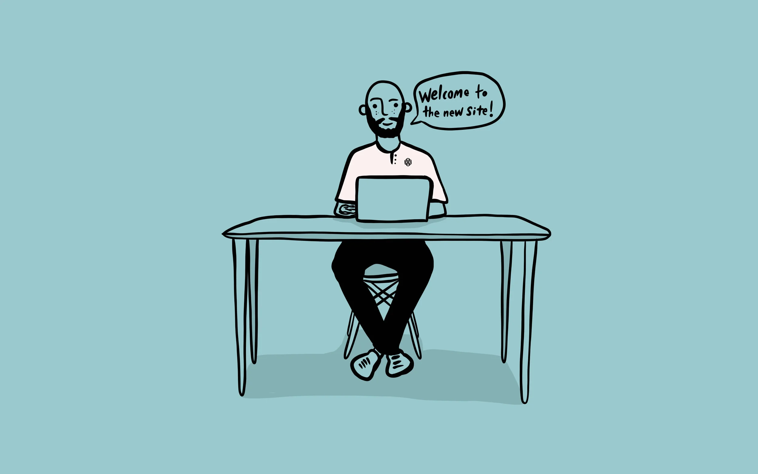
reggae-illustrations

I recently created a series of 3 illustrations of my favourite reggae singers at the moment. These illustrations were all done in the Procreate app on my iPad pro. I had a lot of fun creating these, especially the Koffee illustration as there are a few hidden easter eggs in the signs in the doorway. It’s crazy how good the Procreate app is; I’ve actually more or less stopped using my Wacom tablet and almost exclusively do all my illustrating in Procreate.

Also, just a reminder, if you want to support my work then head over to Patreon and become a patron!

Read More
Nicholas Huggins Nicholas Huggins

Website Redesigned!

Welcome to my brand spanking new personal website. I have made the decision to keep this site as just that: personal. Just over a year ago I formed a design agency that has its own website and I have decided that that is going to be the online home for my client work and commercial projects.

This updated version of nicholashuggins.com is going to be…

blog image-computer.jpg

Welcome to my brand spanking new personal website. I have made the decision to keep this site as just that: personal. Just over a year ago I formed a design agency that has its own website and I have decided that that is going to be the online home for my client work and commercial projects.

This updated version of nicholashuggins.com is going to be something more like a journal (both visual and written.) I will write articles that may, or may not, have to do about design; I will post sketches, personal projects, and really anything that I want to share without the constraints that a “design portfolio” brings with it. My goal is to create things that are a little outside of my usual realm and to give it a home on this page.

If you follow me on Instagram, you will know that I regularly put out a bunch of content that does not necessarily fall under client work, or under the exact definition of graphic design. I like to do hand drawn typography, traditional painting and digital illustration to name a few things. This is going to be the place for all of my random interests and any miscellaneous things that I will not post in my more curated portfolio. So, if you are a potential client, make sure to click the Client Work tab up at the top to see my official portfolio!

Another purpose of this website is to do more writing. One of my interests in life has always been writing and I’ve somewhat abandoned it in the last few years. When you write an article there is an inevitable learning that happens, so I am setting a goal to write more and therefore learn more. Hopefully the more I learn, the better my articles get and the more valuable they are to anyone that comes across this website.

I hope you enjoy looking around the new website and feel free to leave a comment below with any topic you’d like for me to cover. One idea so far is to do an interview series with some of my designer-friends (and non-designer friends as well.)

Thanks for visiting, and reading to the end,

NH

Read More
Nicholas Huggins Nicholas Huggins

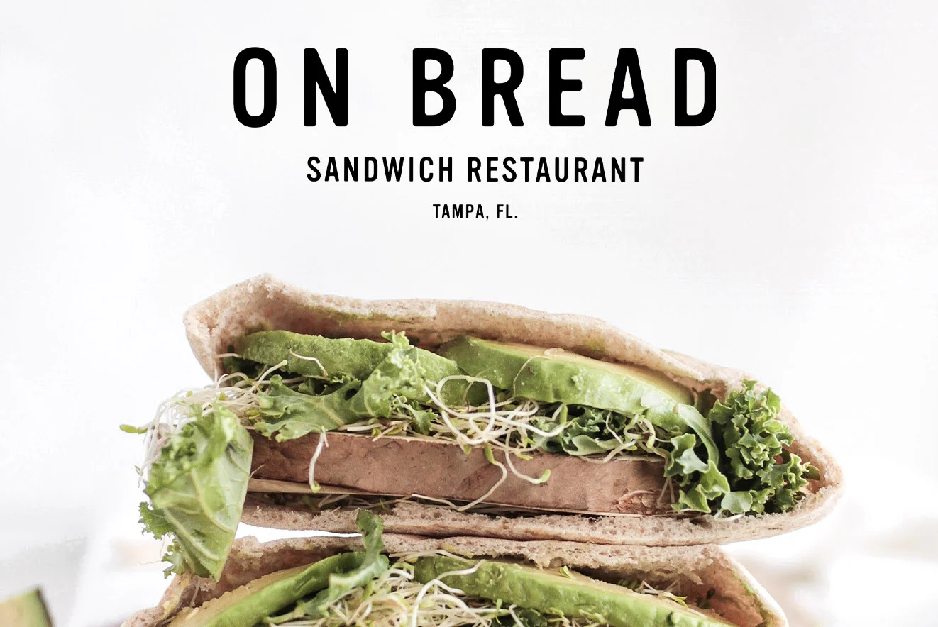
Restaurant Branding Challenge

Today I had some free time and decided to challenge myself by creating a brand identity in less than 5 hours. At around Midday I created a question on Instagram Stories asking for names & styles of restaurants. One of the responses was for a Sandwich restaurant called “On Bread” and this was the suggestion that I chose to go with.

Today I had some free time and decided to challenge myself by creating a brand identity in less than 5 hours. At around Midday I created a question on Instagram Stories asking for names & styles of restaurants. One of the responses was for a Sandwich restaurant called “On Bread, a restaurant that only serves variations of things on bread, for example avocado toast,” and this was the suggestion that I chose to go with.
From just that response I got started envisioning what the brand will look like. It was a lot of fun to work on and reminded me of doing student work where there are no clients. See below for the finished product & let me know what you think.

Read More
Nicholas Huggins Nicholas Huggins

Package Design Love - Pereg Gourmet

The grocery is never a place I would willfully find myself, however since embarking on carving out a niche as a Package Designer I decided that I should definitely go to the home of all these products – the supermarket. The grocery really is a haven for design (both good and bad) and …

pereg gourmet packaging

The grocery is never a place I would willfully find myself, however since embarking on carving out a niche as a Package Designer I decided that I should definitely go to the home of all these products – the supermarket. The grocery really is a haven for design (both good and bad) and to see things through a critical eye has made grocery shopping a lot more interesting. 

This week on my journey through the aisles I came across a brand called Pereg Gourmet. I first came across this brand amongst the flours. They have a wide array of flour variants including coconut flour, plantain flour, banana flour, quinoa flour, band something called "farro" flour. The design is what caught my eye, as it was an illustrative label, a design style that I am personally very attracted to. Just from the design, you could immediately tell that the product was of a high quality; this was reflected in the price.

The design system for the Pereg Gourmet flours are on point, the variant name (e.g. "Plantain Flour") is front and centre with the logo smaller and to the top left. The brand relies on their product to sell itself, and not the name of the brand. The illustrations are all done in a simple style, yet at a glance, you know exactly what they are trying to tell you. Overall I was super impressed with the Pereg Gourmet flour designs. 

I then stumbled across their Red Quinoa packaging and was equally impressed. It was different in style to the flour packaging, but still maintained the quality. Instead of illustrations to show the product, Pereg used macro photography across the top of the pouch to show a close up of the red quinoa. The bottom of the pouch had a window to see the actual quinoa inside the packaging.

Once I got home from the grocery, I went on to the Pereg Gourmet website to see what else they made, and how they were packaged. The short answer- they make a ton of stuff, and they are all packaged really nicely. I urge you to take a look at their site if you want to see some more stuff not shown in the blog (click here to see their site.) 

Leave a comment letting me know what you think of the Pereg Gourmet packaging, and if there are any other products you think I should look at the next time I go grocery shopping.

Nicholas Huggins is a package designer based in Trinidad & Tobago, click here if you are interested in working with him.

Read More
Nicholas Huggins Nicholas Huggins

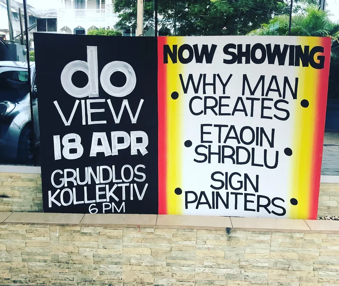
DO View - Sign Painting

I've always loved Sign Painting. So when I heard that Design Objective would be hosting a viewing of Sign Painters, a film on sign painting, I knew I had to be there. The event was held at Grundlos Kollektiv, a new creative space on Cipriani Boulevard, and was…

The sign painted by Bruce Cayonne for the event.

The sign painted by Bruce Cayonne for the event.

I've always loved Sign Painting. So when I heard that Design Objective would be hosting a viewing of "Sign Painters," a film on sign painting, I knew I had to be there. The event was held at Grundlos Kollektiv which is a new creative space on Cipriani Boulevard, and was well attended.

There were 2 movies that preceded the main film of the night, the first was "Why Man Creates" by Saul Bass, a short-film on just that – why man creates. The second film was "Farewell, Etaoin Shrdlu," a documentary on the last day of the use of a hot metal press in the New York Times. Both these films were quite interesting but I did prefer "Farewell, Etaoin Shrdlu" as it documented a time in graphic design that is completely different to the digital age that modern designers now live in.

The movie about to begin!

The movie about to begin!

The film was especially inspiring, and definitely shed a light on the art of hand-painting signs. In a time where vinyl signs are relatively cheap and easy to produce, it must be appreciated how special a hand-painted advertisement can be. Hopefully we can see more hand made design examples in Trinidad.

One of my favourite parts of the evening was walking into the venue and seeing that Design Objective got Bruce Cayonne (the guy who paints most of the fete signs in Trinidad) to paint a sign for the event. Bruce was in attendance to watch the film along with his son (and some more example of his fete signs.) 

Some of the fete signs on display inside the venue.

Some of the fete signs on display inside the venue.

I've been documenting hand painted typography examples in Trinidad on my Blog "Type of Trinidad" for the last 5 years, and Bruce's work is often the subject. One of his signs has even found a home in my living room and I have previously written about fete signs on this blog.

All in all, it was a good night and I am looking forward to the next DO event!

Here are some more photos from the event –

Read More
Nicholas Huggins Nicholas Huggins

Q&A with Nicholas Huggins in T&T Guardian

I was recently interviewed for REC magazine, a pull out in the T&T Guardian, see below to read the interview in full.

nicholas huggins trinidad guardian 1

I was recently interviewed for REC magazine, a pull out in the T&T Guardian, see below to read the interview in full.

What originally made you want to become an graphic designer?

I have always been interested in Art and studied it until Form 6 in CIC. When I left CIC, I decided that attending an art & design university was the best bet for me, so I went to SCAD with the hope of studying illustration. I didn’t really know what “graphic design” was at the time, and after taking an Intro to Graphic Design class I decided that I was more interested in studying and learning about Graphic Design than I was Illustration. I feel like my original dream of illustration is still alive and I try to incorporate it into my design work. 

How would you describe your approach to design?

With any project that I take on, my approach is pretty much the same. At the end of the day, design is not about the designer…it is about the client and what the client needs. I may think something will look amazing, but if it doesn't suit the client’s needs then it can't work. That being said, I try to learn as much about the client’s business as possible. I do this through interviews with the client as well as scoping out their online presence and checking out where they sell their products etc. If I’m designing for a new product, the research part will be a bit different but I will still research their competitors, I research similar businesses in their market, as well as markets in other countries. After a lot of research I then start sketching and figuring out what works and what doesn't work. But a lot of my approach is research driven and filtering what is best for each job.

Who or what has been the biggest single influence on your approach to design?

The biggest single influence on my approach to design would probably be my education at SCAD. I had a few really good classes and professors there who really stressed the importance of research, sketches, trial and error and coming up with a good idea. No matter how good the execution of a project, if you don't lay the groundwork to come up with a good idea, the project will usually fall flat. 

What type of brief or project do you enjoy working on the most?

Right now I've been doing a lot of package design projects and I think that these are probably the projects that I enjoy working on the most. I especially love working with clients who are extremely passionate about their product and want it to look as good as possible on the shelves in order to grow their business. It’s one thing to have a pretty product, but its another thing to have a product that is packaged with the intention of increasing business and visibility to customers. 

What would you say is your strongest skill?

Not sure if this is a skill, but I’ll go with my work ethic. When I was younger I would read interviews with designers I admired and they all spoke about working weekends, working 16 hour days, work work work…and I never thought that I would enjoy a life like that. But since I started working I’ve found myself in the same boat of working long hours, however it is super enjoyable to me so I don’t really see it as a burden. 

What are your thoughts on specialization vs generalization?

I think both have their merits, and I see the value of being a designer who specializes. However I think the benefit of generalization in design is that you continuously push yourself creatively by trying new things. For me it’s about balancing both, I try to put my focus on packaging but I find myself experimenting with illustration, painting, chalkboard art amongst other things.

What are you currently fascinated by and how is it feeding into your work?

I've always been fascinated with colour and I think my work has been characterized by use of colour. We are fortunate to live on a Caribbean island where we are bombarded with a variety of colors on a day to day basis… houses, trees, mountains, parlours, fete signs, carnival….we are a very colourful society, and I think I try to reflect that in my work.

What’s the best piece of advice you have heard?

In terms of design, I was taught to separate yourself from the work. Designers aren’t artists, we are visual communicators who usually have to communicate the ideas of other people (clients.)

From your instagram you seem fascinated by portraits and landscapes. Talk about it.

My Instagram feed started as an experiment to see what sort of impact I could make if I posted every single day for a year. I chose to draw things that I like…musicians whose music I listen to, actors whose movie or tv show I've enjoyed. Pretty much anything that I liked in the moment I illustrated. A lot of the times it happened to be “celebrities” but a lot of the times it was also landscapes as I think that Trinidad is such a beautiful place with a lot of unique characteristics so I tried to capture that in some of my illustrations. 

nicholas huggins trinidad guardian 2

Thanks to the T&T Guardian for this cool feature!

Read More
Nicholas Huggins Nicholas Huggins

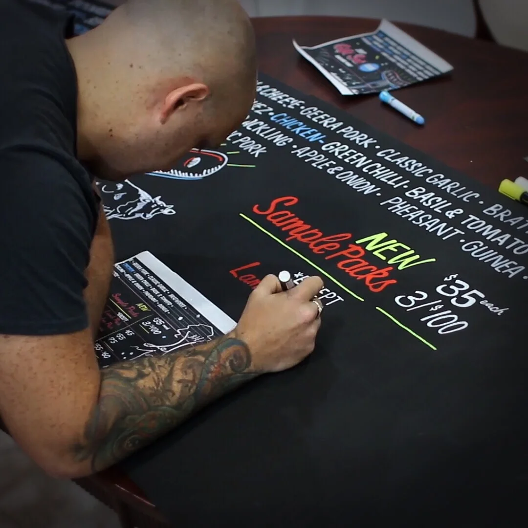
How I Started Doing Chalkboard Art

Let me give a bit of a back story as to how I got into illustrating chalkboards...
Matthew of Sticky Bones BBQ asked me one day if I would quote him to do some illustrations on the chalkboard...

Let me give a bit of a back story as to how I got into illustrating chalkboards...
Matthew of Sticky Bones BBQ asked me one day if I would quote him to do some illustrations on the chalkboard inside the restaurant. Apart from a few years of doing graffiti (which is super different), I had never really done anything like that...but I decided that between the time that the quote was approved and me actually having to do it, I would be able to give myself a crash course.

I got my hands on a small board, borrowed from a school, and got to work doing smaller sketches (seen below) to get the hang of it. It took me about 17 seconds to realise that chalk itself does not lend itself to creating clean illustrations because of all the powder and chalkdust. Cue one quick google search later and I quickly learnt of chalkboard markers! It's basically a felt tip marker that has a mix of water and what I assume is some kind of chalk-like colouring...but it gives you the cleanest lines possible, while still being able to be erased as easily as regular chalk.

So after a week or so of practice, I went into Sticky Bones on a Sunday and got to work! In addition to illustrating the board, I also decided to shoot a time-lapse video of the 4 hours spent illustrating to post on social media. The video served as a marketing tool not only for Sticky Bones, but for me as well, and it definitely created a little bit of a buzz over on my Facebook Page and Youtube Channel. This job led straight into another job for Aioli Marketplace who had seen the work that I had done for Sticky Bones.

The Aioli Marketplace job was pretty big and so I knew I needed a small army of chalk markers to complete the job, so I went on to Amazon and ordered a bunch of chalk markers to a friend in Florida to bring to Trinidad for me...but then Hurricane Irma happened and the markers made it to Trinidad 4 days after the job was completed. Luckily I was able to purchase what I imagine was every chalk marker in Trinidad, and combined with my new locally bought stash I can take on any job of any size. 

Once again I made a time-lapse video because of the success of the first one. The scale of the Aioli Marketplace job was much grander than the Sticky Bones job, and took about 18 hours in total over the course of 3 days. My arm was stuck in the upright position for a few days after.

The video for Aioli Marketplace was another success and showed me the importance of not just doing a job and leaving it. In order to promote your services you need to tell people about it...and if your client gets a video out of it to show off their new place and get a buzz going, then even better!

And now, I'm writing this in the wake of completing my third chalkboard project. This time around, it was for Del Mano Food, a local company that's know for their sausages & pestos. Another video was made and I can now say that I have added Chalkboard Illustration to my CV. It's a really fun thing to do, and any excuse to remove my eyes from the computer screen is welcomed. Doing chalkboards has been a fun way to practice design in an unconventional way, and it always looks good in the medium of time-lapse videos (it does not make for a riveting Facebook/Instagram Live though.)


Fill out the Form below if you are interested in having Nicholas illustrate a chalkboard for you!

Read More
Nicholas Huggins Nicholas Huggins

The Sweet Beet Redesign

One of my recent projects was the redesign of The Sweet Beet labels. The brief was simple; Alix & Stefanie (The Sweet Beet co-founders) wanted new labels that carried a visual punch. Something that stood out on the shelves of the stores that carry their products along side other similar products of different brands. They wanted a product that they could proudly show off, and hopefully one that their customers will show off as well...

A couple spread from my sketch book

A couple spread from my sketch book

One of my recent projects was the redesign of The Sweet Beet labels. The brief was simple; Alix & Stefanie (The Sweet Beet co-founders) wanted new labels that carried a visual punch. Something that stood out on the shelves of the stores that carry their products along side other similar products of different brands. They wanted a product that they could proudly show off, and hopefully one that their customers will show off as well...letting good design be the silent ambassador for their brand (as branding legend Paul Rand once famously said)!

A photo from my visit to Starlite.

A photo from my visit to Starlite.

I have always enjoyed their products, so my first step in researching this job was to head to Starlite in Maraval to scope out the shelves (and pick up some of my favourite Sweet Beet juices...research.) After quenching my thirst...for information, I opened up my laptop and created a Pinterest board to start hoarding ideas & digital inspiration. This is typically one of my first steps...to immerse myself with visuals and inspiration. 

After a lot of "Pinning," the next step of the process is taking a break. I usually like to leave the job alone for a few days, sometimes up to a week depending on the timeline, to just let the ideas start brewing. This stage usually coincides with the beginning of the sketching phase. While sketching I stay away from looking at the saved inspiration on Pinterest; it's time to let it sit in the subconscious and maybe creep into the sketches a little bit. The "sketching phase" for The Sweet Beet also coincided with a vacation I had planned to Florida which worked out well, as I love sketching on airplanes. Every final design had elements from sketches done on that trip, so I considered it successful! 

Once I had done enough sketches that I was comfortable with, I opened up Adobe Illustrator and got to work. To begin, I created a file called "sweetbeet_exploration" which I used as a digital sketch pad...refining what was already done in my sketch book. A lot of times, you sketch something that looks figured out, but you start creating a more refined version on the computer and for some reason it doesn't work. This initial exploration file is to ween out what works and what doesn't work; and to eventually decide what will be presented to the client.

My Adobe Illustrator artboard showing visual exploration.

My Adobe Illustrator artboard showing visual exploration.

Upon completion of this visual exploration in Adobe Illustrator, I then choose what is working the best and refine those options even further. I usually choose either 2 or 3 options depending on how strongly I feel about the concepts, and these are what will be presented to the client. In the case of The Sweet Beet, I presented 3 options to them...but we will get to that in a little while. I was tasked with creating the labels for 16 different variants of Cold Pressed Juices, Nut Milk Drinks, and Smoothies. Instead of designing all 16 flavours for the initial presentation, I just chose 2 flavours to design to give them an idea of each concept. 

Finally, after all of these processes, it is time to present to the client. I visited their store in West Mall, popped open the PDF on my laptop and went through all the options with Alix & Stefanie. This is always the most exciting moment of the entire operation because it serves as the moment of truth when the client sees what I've been working on for the first time. I chose to present 3 options and of the 3 options, they chose my personal favourite to move forward with.. 

The 3 options presented to The Sweet Beet team.

The 3 options presented to The Sweet Beet team.

Once the client selected the visual option they liked best, the next step was to fully flesh out all 16 designs. I presented only 2, so the work on the next 14 began. I brainstormed ideas with Alix & Stefanie, and then got to work illustrating and designing each of labels. Once all 16 were completed, I then presented all the new labels again. Of course, there were some minor changes to a few of the labels, but all in all we had locked down what the final design for most were going to be. After the changes were made, and approval was given to every design, Finished Art Work was done and handed off to the printers who were charged with bringing the new labels to life!

The evolution of the final design.

The evolution of the final design.

The best feeling of any project is seeing all the hard work come to fruition. Seeing all the bottles with the newly designed labels was an amazing feeling after all the hours put in to perfecting them. It's always a pleasure to work with clients who are super passionate about their products and who want to push the limits to get a design that suits their business. Before the official release of the new designs, I did a photoshoot in my home-studio set up to get some nice shots of the bottles isolated on a white background. A photoshoot was also done outside to get some "in situation" style shots. To see all the photography and the full project, click this link. 

SB photo.jpg
SB banner.jpg
Read More
Nicholas Huggins Nicholas Huggins

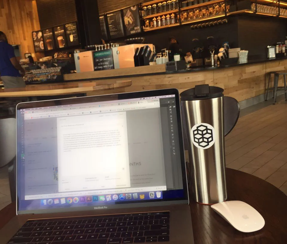
My First Week as a Freelancer

So last week Thursday was my last day as a McCann Port-of-Spain employee, and the day was bitter sweet. I said my good byes and that night I went with some friends to our favourite, Dr!nk Lounge & Bistro, to celebrate with some ... well ... Dr!nks. After that we…

So last week Thursday was my last day as a McCann Port-of-Spain employee, and the day was bitter sweet. I said my good byes and that night I went with some friends to our favourite, Dr!nk Lounge & Bistro, to celebrate with some ... well ... Dr!nks. After that we went to Paprika, and then we went to 51. Fast forward a few hours and it's now 9am and my alarm is buzzing because I have a meeting at 10...no rest for the wicked. Day 1 is followed up with 2 more meetings, both back to back in Starbucks. One with a friend/client and his business advisors to talk about a package design I had done the first draft of a while ago; the second meeting with Kevin (Deftment business partner) and an amazing photographer that we will be working with on Deftment's 2017 lookbook ... stay tuned for more of that.

Last photo with some of the McCann Ideation team

Last photo with some of the McCann Ideation team

Day 2 of freelancing was a Saturday and I was off to Starbucks to get a head start on some work that I had due Monday. The evening was spent printing t-shirts for Printmint/ chilling with friends. That night was an early night because the next morning was an early rising morning helping out Alex with a photoshoot on Las Cuevas beach, which is amazing early in the morning (except for the sand flies.)

Early morning Las Cuevas.

Early morning Las Cuevas.

On day 4, my first Monday as a freelancer, I went to Starbucks to work on a new branding and packaging project that y'all can look out for in the next couple of months once the project is launched. Alex and I also had a nice long conversation with the amazing photographer, Marlon James, who was sat next to us. I was worried about leaving the creative haven of McCann, but alas, Starbucks may be a good replacement. I also spilled half of my (hot) black coffee on my leg and all over the floor...I was amazed at how much liquid was in that cup. On day 5 (Tuesday) I worked from home and had a pretty productive morning. In the afternoon I went to the gym, and upon leaving I noticed that the weather was suited more for the beach, and not so much for in front of my computer...so I gave my (self employed) sister a call and off we went to Maracas Bay. More work ensued that evening however.

At least I got some inspiration for an illustration on the way to the beach!

At least I got some inspiration for an illustration on the way to the beach!

On day 6 I was back in Starbucks for an early morning meeting and design session...nothing too exciting, but quite productive. The afternoon was spent working from home, and the night was spent printing t-shirts. One week after my last McCann day was a good one. I woke up later than usual (9am) because of the late night the night before, and worked all morning from home. At 3pm I went to Trotters to watch my first mid week Manchester United game in a long time! That evening was spent having some beers with friends and nicely capping off my first week being self-employed (or un-employed depending on who you speak to.) Here's to many more!

Read More
Nicholas Huggins Nicholas Huggins

How I grew my Instagram following to 5000 in 5 months

I started my Instagram journey on Feb 21st 2016 feeling pretty inspired. I made a pledge to post an illustration everyday onto the social media platform in the hope of becoming better at what I do and at the same time broaden my audience and get more

I started my Instagram journey on Feb 21st 2016 feeling pretty inspired. I made a pledge to post an illustration everyday onto the social media platform in the hope of becoming better at what I do and at the same time broaden my audience and get more clients. By spending at least an hour a day (sometimes way more) illustrating, I should become a better illustrator right? 

I was using my "professional" Instagram account @nicholashugginsdesign where I already had 800 followers that I accumulated by sporadically posting for the past few years. The account was, for the most part, dormant but I planned to change that. The goal was to start posting everyday and use the account to generate more paid work by doing a lot of unpaid personal work. 

First things first, I approached this project like any other by starting with some research. By looking at what other successful designers were doing on Instagram, I was be able to look at what they were doing right or wrong and then use that information to my own advantage. I also needed to see what hashtags to use, and I did some research into using the hashtags without looking spammy, but still getting the most out of them. You can check out my account to see how I use hashtags without them appearing in the description of my photo. 

On Feb 21st I started testing the water with an illustration of Kanye West. By March 6th I started posting daily, and three days later (March 9th) I posted an illustration of Aaron Draplin, a designer who is a huge inspiration to me. That post got around 650 likes and a lot of attention on Instagram from other users. In that time I had gone up to over 1000 followers, and that gave me the push to continue as it meant that people were connecting with the work.

A legendary, bearded Graphic Designer 👉🏼 @draplin

A photo posted by Graphic Design/Illustration 🇹🇹 (@nicholashugginsdesign) on

In the early weeks of posting, I did a lot of celebrity portraits and fan art. One portrait I did of reggae singer Kabaka Pyramid, resulted in him reposting (which got a lot of new followers for me) as well as him hiring me to design a t-shirt for him. This was one of the first instances of Instagram becoming a source of income for me. Fortunately it wasn't the last, and I've since worked with a bunch of really cool people who have all contacted me through Instagram...it has proven to be a great connector.

All this time I made sure to continue posting daily, and it became a routine in my life. Each illustration took anywhere from one to four hours depending on the intricacy of it, and the hardest part was trying to come up with new stuff to illustrate daily. My following on the app grew continuously as people found me through my hashtags and random posts popping up on the explore page. The main thing was to interact with other people in the design community. I spent a nice portion of time daily traversing through hashtag feeds and liking images, or leaving a comment on stuff that I liked.  This turned out to be a really effective way of getting people to come check out my page who may not have been able to find it otherwise. 

In this time I also made a few design tutorials and put them on Youtube, and I was featured on a couple of online blogs. By generating a lot of content, my online community was growing and more jobs were coming my way.

Another fun job that came through Instagram was designing album art for DJ R-Wan. You can see all of the stuff I did for him by checking out his Soundcloud page

 My Instagram project was affecting both my side projects/freelance work as well as my day job. Check out the photos below to see some of the illustration work I did for Bmobile, the largest telecoms provider in Trinidad & Tobago and a client of McCann Port-of-Spain.

All these things have helped me to one, become a better designer and illustrator, and two, to build my Instagram following which positively impacted my paid work. Instagram has proven to be an extremely useful tool for people in art and design to get noticed by anyone globally. So if you haven't done so already, go follow me on Instagram (see what I did there), and leave a comment on one of my images!


Further reading- Ten Vector artists to follow on Instagram  (A list of ten people in my field that I love to follow)


Read More
Nicholas Huggins Nicholas Huggins

Talent

My name is Nick Huggins and I don't believe in talent. I never have and I probably never will. Well, at least the dictionary definition of Talent.

Talent, as defined by the top hit on google is...

My name is Nick Huggins and I don't believe in talent. I never have and I probably never will. Well, at least the dictionary definition of Talent.

Talent, as defined by the top hit on google is "...the skill that someone naturally has, to do something that is hard. It is an ability that someone is born with..."

Now let me share with you, a quote by the (extremely talented?) Mixed Martial Artist Conor McGregor- "There's no talent here, this is hard work. This is an obsession. Talent does not exist, we are all equal as human beings. You could be anyone if you put in the time. You will reach the top, and that is that. I am not talented, I am obsessed."

Since I've been a child in primary school, art has always been a passion of mine and I was lucky enough to know at a young age that I wanted to be an artist. With the encouragement of my family and teachers, by the time I was ready to head to university there was only one choice for me- Art & Design school. I went to SCAD, and at the end of my first year decided to go into graphic design with pretty much zero experience in Adobe Illustrator or Photoshop. However I was dedicated to learning whatever was needed of me to succeed.

Does this mean I am a "talented" artist or designer...I don't think so. I am simply obsessed with learning this field; practicing everyday; designing and illustrating for late hours into the night. 90% of my books are books on design, my bookmark tab on my computer is filled with design websites; I am most passionate when speaking about design and spend almost all of my free time on the computer watching tutorials, illustrating, experimenting, sketching, whatever. I post new illustrations almost daily onto Instagram, work as a designer all day at an agency, operate a t-shirt company, freelance, do commissioned illustrations, and the list goes on.

I used to read interviews from designers who spoke of working 15 hours everyday, and working on weekends. When I was a teenager, this seemed insane...I now realise that it is what is needed.

It is an obsession, not a talent.  I speak a lot here about design, because that is what I do. However this same idea can be used across the board for anything and I think that anyone with an obsession in any field can reach a certain level of success if they put in the time and the effort. Of course there are some things where physical attributes or levels of intelligence or personality traits may work either for or against you (I'm not going to go into the 100M Dash anytime soon) ... but still- Get started on what you want to do today and soon enough you will get there. 

I know the word talent isn't going to leave the lexicon of humankind anytime soon, and I don't think it should. But just know that behind every "talented" individual is a lot of hard work and effort and not the result of some innate #bornthisway #wokeuplikethis skill.

If you are interested, here is a slideshow of where my art and "graphic design" skills were the couple years before going to university (Circa 2006-08)... This stuff is embarrassingly bad compared to what I see teenage graphic designers and illustrators doing on Behance or Instagram and if anything, is proof that anyone can do this. ----

Read More
Nicholas Huggins Nicholas Huggins

How I Started My Own T-Shirt Brand **PART 2**

In Part 1 of this series I outlined the process of coming up with a name and developing a brand identity for my t-shirt brand, Deftment. Now I will explain ....

We ended up choosing the design to the far right.

We ended up choosing the design to the far right.

In Part 1 of this series I outlined the process of coming up with a name and developing a brand identity for my t-shirt brand, Deftment. Now I will explain a bit about everything else leading up to our launch. While coming up with the branding for Deftment, the designing of the actual tees were also underway. The design process was pretty straight-forward, I usually start with sketches or just writing down ideas in my sketch book before I start doing anything on the computer. For our first line, close to 50 designs were done that we needed to cut down to five final choices to be printed.

Some of the initial designs

Some of the initial designs

Top Left was chosen

Top Left was chosen

A couple of the above designs made the initial print, but most did not for various reasons. Some of the multi-coloured ones had to be taken out for cost purposes, others weren't used because they did not fit in with the ultimate aesthetic of the brand, and some weren't used because they just weren't good enough. At the end of the day, we wanted to not be able to choose a favourite amongst the final designs and we knew that to achieve this we had to spend a lot of time honestly critiquing the work. 

Rejected Test Print 1- The black strokes were a bit too thin

Rejected Test Print 1- The black strokes were a bit too thin

Rejected Test Print 2- The text was too thin and did not match what we wanted.

Rejected Test Print 2- The text was too thin and did not match what we wanted.

After choosing the final designs, the next step was actually sourcing the tees and getting them printed. From the very beginning we knew that we wanted our tees to be of the highest quality which would result in slightly higher prices, but we knew that people would pay for the great quality that we intended to supply. After locking down a US based t-shirt supplier, we found a local print shop to deal with the printing. One of our first problems was that we probably didn't give ourselves enough time to print, and therefore received the final t-shirts on the morning of our launch. It was a close call, but luckily everything worked out in the end.

Nick, Laura, Kevin & Ashley at the Launch.

Nick, Laura, Kevin & Ashley at the Launch.

We launched on a Friday night at a retail store that was being occupied by a couple friends (Laura & Ashley) for the summer months. Deftment was going to move into their space for a couple days to launch the brand. On the Friday night we had drinks, music and all round good vibes. What made it better was that a lot of our friends passed in and made purchases. The compliments as well as the actual purchases legitimized the amount of hard work we put in, and it was definitely worth it in the end.

In Part 3 of this series, I will share the details of where Deftment is now, and how we have developed and evolved since the inception of the brand. Here are a few more photos of the launch in the mean time----

Read More
Nicholas Huggins Nicholas Huggins

How I Started My Own T-Shirt Brand **PART 1**

The idea for what became Deftment began over a year before our launch, when my good friend Kevin and I dreamed of creating quality tees with a unique Caribbean style. I have always...

logo

The idea for what became Deftment began over a year before our launch, when my good friend Kevin and I dreamed of creating quality tees with a unique Caribbean style. I have always loved t-shirt design because a t-shirt is something that everyone owns, thus making the art/design on it something that is available to a huge audience.

We officially launched Deftment on October 3rd 2014, but the real work on the brand began a year before in September, 2013. Our vision at the time was simple, to provide high quality tees that were suited to a Caribbean lifestyle. This meant that it had to be stylish, versatile and durable; it should transition from the beach, to the pavement bar, to an all-inclusive fete with ease. The Caribbean is full of skilled individuals ranging from artists, musicians, chefs, DJ's, fashion designers; and these were the people who we detailed as our ideal customer. Our brand had to reflect this culture, and this passionate bunch. I had an idea of what I wanted aesthetically; something that drew from elements of typography, nature and mathematical geometry...we just had to figure out how to pull it all together. Developing a name posed a challenge. We wanted to invent our own word, something that we could define without preconceptions. Deftment is a portmanteau of deft, as in skilful, and movement. We set out to be a skilled movement.

In these two pictures I was getting close to the final logotype for the word DEFTMENT. I hadn't settled on a final logomark, the symbol that represented the brand (i.e. the Nike Swoosh vs the word NIKE.)The final logomark was made up of a series of hexagons, and you can see the inception of this idea from the pictures here.

The next thing on the list was creating a brand identity for Deftment starting with a logo. As I stated earlier, for the aesthetic of the brand we wanted to feature different geometric elements, and this was what I focused on with initial logo explorations. 

We were looking for those geometric elements for the logo, and it all came to be by experimenting. I was trying to digitally create the face of a monkey using only geometric shapes. I drew a few hexagons and got to work resulting in something really close to what is the final logo. 

A lot of tweaking and hard work went into perfecting the logo, as it would be the cornerstone of our brand and something that people would associate us with. I think the result was successful because it responded to our initial needs, and in the end we ended up with something that we set out to achieve in our own design brief. 

In Part Two I will discuss the lead up to our launch, and the design process for the first Deftment Line. 

Read More
Nicholas Huggins Nicholas Huggins

How Advertisers are using Pokemon Go

Unless you've been living under a Geodude for the last month, you would have heard about Pokemon Go by now. Pokemon Go will definitely...

Unless you've been living under a Geodude for the last month, you would have heard about Pokemon Go by now. Pokemon Go will definitely go down as a (video) game changer when the history books are written and it is particularly interesting to see how brands are using the hype to promote themselves and to be a leading member of the bandwagon.

Pokemon Go launched in Trinidad & Tobago (along with the rest of the Caribbean) a bit later than other parts of the world, so by the time it hit the shores of our islands, the hype was at a fever pitch. Advertisers knowing this, were quick to use the excitement to their advantage.

Here are a few Facebook posts by some of the brands in Trinidad& Tobago.

Leave a reply in the comments to let me know which are your favourites, or if I missed any good ones.

Read More
Nicholas Huggins Nicholas Huggins

My Top 5 Favourite Summer Olympic Logos

So with the 2016 Rio Olympics upon us, I decided to do a countdown of my Top 5 favourite logos from every Summer Olympic Games. Let me know which you like or if you think...

So with the 2016 Rio Olympics upon us, I decided to do a countdown of my Top 5 favourite logos from every Summer Olympic Games. Let me know which you like or if you think I left any out.

5. LA 1984- I love the treatment of the Stars & Stripes in this logo. From the use of negative space to create the white star, to the "movement" effect created with the stripes. It is a memorable logo with all elements working well together. This logo is as American as they come utilizing red, white & blue, and the stars and stripes.


4. Athens 2004- I love the use of the olive wreath in this logo. The olive wreath was the prize for the winner at the ancient Olympic Games, so it is a nice "throwback." Without saying where the games are, the viewer can assume that it is Greek based on the colours and the content. Super effective, and very memorable.


3. Rio 2016- A very dynamic logo and logotype. The font treatment is really unique and works really well with the logo mark which depicts three figures in embrace. I really like the overall vibrancy of this and it gives us an essence of the host city.


2. Beijing 2008- My favourite part of this logo has to be the calligraphy treatment of the host city and year (I especially like how the "iji" work next to each other.) The brush stroke application of the man (The Dancing Jing) on red makes up what is an overall pleasant composition. The logo pulls elements from the host country and is very  successful.


1. Tokyo 1964- The gold treatment of the logotype and the Olympic rings; the stark, red, Japanese rising sun; the no nonsense san-serif typeface. There is so much to love about this extremely simple, yet exceptionally effective logo; less is definitely more. This was an easy choice for me!

Read More
inspiration Nicholas Huggins inspiration Nicholas Huggins

How to stay inspired?

There are some weeks where I feel a sense of artistic inspiration from morning until night and I find the ability to create a lot of illustrations and think of a bunch of cool ideas with seamless ease. Other weeks however, it is a bit of a struggle to find the energy to pull out a blank canvas or to create a new file in illustrator. If this happens to you as well, I've put together a few things I find helpful to do when I'm stuck in a rut that help me find the creative energy…

There are some weeks where I feel a sense of artistic inspiration from morning until night and I find the ability to create a lot of illustrations and think of a bunch of cool ideas with seamless ease. Other weeks however, it is a bit of a struggle to find the energy to pull out a blank canvas or to create a new file in illustrator. If this happens to you as well, I've put together a few things I find helpful to do when I'm stuck in a rut that help me find the creative energy.

1) Look at other artists/designers who are better than you. My number one source for finding and interacting with other designers is Instagram. Check out some of my favourite Instagrammers here.

2) Check art/design blogs. My favourites are This is Colossal, Design Boom and Abduzeedo. There are many others out there that are endless sources of inspiration.

3) Talk to other artists. Catch up on what your designer friends are up to; they may have some extra ideas up their sleeve or a different perspective on a project you may be working on even if they are not in the same field as you. I am an illustrator and graphic designer, yet whenever I need advice or inspiration, one of my go to's is my friend Fede who is an Industrial Designer.

4) Doodle. By simply opening a sketch book and doodling, your brain starts thinking of ideas. This is especially true if you work a lot on the computer. Taking a break and doing an actual sketch helps in the design process.

I always start with sketching.

I always start with sketching.

5) Open a book. There are so many art/design books out there that are full of ideas, you can't help but feel inspired. A few of my favourites are Things I have Learned in my Life So Far by Stefan Sagmeister, Graphic Design- A New History and Pretty Much Everything by Aaron Draplin

My copy of the great book by Stefan Sagmeister

My copy of the great book by Stefan Sagmeister

6) Go for a walk. There are so many things to see outdoors, and by changing where we go, it opens our eyes to new things and ideas. 

7) Go through old work. Sometimes your old work may inspire a new project, or maybe you might find a way to improve on your past designs. Many times I have gone through an old sketch book and found an overlooked concept or idea that is relevant to something I was working on.

8) Make lists of ideas. Writing lists (even when you are not in a creative rut) helps the creative method. For every 10 things you write down if you get one good idea out of it, you will eventually have a lot of ideas stored up over time. I try to add a few ideas to my list every day, and every so often I go back to search for inspiration.

Make lists of ideas!

Make lists of ideas!

9) Take a break. Sometimes overthinking takes a toll, and it is best to just walk away from your work and relax. Let your brain do some subconscious problem solving and then attack the project with a reinvigorated energy.

10) Listen to music. Everyone has music that they like to listen to while they create work. Put on your favourite tunes and wait for the creative juices to start flowing. Click here for a song that I love to listen to when working.

Hopefully this was all super helpful and maybe you found some inspiration in the list of things that I do. If you have anything to add feel free to leave a comment!

Read More
Vector art Nicholas Huggins Vector art Nicholas Huggins

10 Vector artists to follow on Instagram

Instagram has recently become my new favourite social media platform, and I have been spending maybe too much time on the app. Apart from posting everyday, I also thoroughly enjoy going through the feeds of other designers and illustrators. There are a few that when I see their work I think "dammit, I wish I thought of that." Here is a list of ten of those vector artists that I always keep up with (in no particular order.) Make sure to give them a Follow to be inspired everyday!

Instagram has recently become my new favourite social media platform, and I have been spending maybe too much time on the app. Apart from posting everyday, I also thoroughly enjoy going through the feeds of other designers and illustrators. There are a few that when I see their work I think "dammit, I wish I thought of that." Here is a list of ten of those vector artists that I always keep up with (in no particular order.) Make sure to give them a Follow to be inspired everyday!

1. @MUSKETON- Musketon is an illustrator hailing from Belgium whose working is pretty amazing. He has a lot of give aways and posts regularly so is definitely one to follow.

A photo posted by musketon (@musketon) on


2. @THOMCAT23 - It amazes me the amount of work Thomcat 23 puts out on a regular basis. What is really cool is that he shows his process from sketches to finished piece.

A photo posted by Thomcat23 (@thomcat23) on


3. @TAJFRANCIS - A fellow Caribbean illustrator, this Jamaican is doing huge things in the design world with a unique style.

A photo posted by T Λ J Tenfold (@tajfrancis) on


4. @DANMUMFORDDRAWS - The level of detail in Dan Mumford's work is astonishing, and he works on some really cool clients.


5. @SWEYDA - Sweyda's work epitomizes patience with the pen tool in illustrator. Truly a master of the craft.

A photo posted by Jared Mirabile (@sweyda) on


6. ZPREP - This guy is all about the lines, his work is pretty cool and he illustrates a lot of Star Wars characters which is a bonus.

A photo posted by Nathan Owens (@zprep) on


7. DLO168 - A modern take on Art Nouveau, DLO168 is a great illustrator.


8. THOMAS_DANTHONY - His super simple style definitely stands out. I also love the colour palettes that he uses.


9. TIMBASMITS - A sweet 1950's look makes his work really amazing.

A photo posted by Timba Smits (@timbasmits) on


10. GAKSDESIGNS - A fellow Trini artist, Gaks is the self proclaimed Master Vector Ninja, and his work certainly speaks for itself....seriously, check out that line work.


As a bonus, make sure you follow my Instagram page -- NICHOLASHUGGINSDESIGN -- to see some cool stuff posted daily!

A photo posted by @nicholashugginsdesign on

Read More
Uncategorized Nicholas Huggins Uncategorized Nicholas Huggins

A few updates

Hey everyone, I just wanted to share some news/updates here…

deftment feature

deftment feature

Hey everyone, I just wanted to share some news/updates here.

Firstly, I am working on a brand new portfolio website so make sure to stay on the look out for that! It will have a ton of new work and projects that I've been holding off on posting until I was able to update my site. It's very exciting, but is proving to be a whole load of extra work to add to an already busy schedule.

Something else that was exciting this year was being featured in two magazines. The first was T&T Entrepreneurs magazine. Click the link to see the feature or just check out the screenshot below.

The second magazine is a really cool publication called Bassculture Islands out of Poland. They featured my illustrated portraits alongside an interview as well as using my typographic illustrations throughout the rest of the magazine.

Screen Shot 2016-02-17 at 2.09.05 PM

Screen Shot 2016-02-17 at 2.09.05 PM

Screen Shot 2016-02-17 at 2.09.12 PM

Screen Shot 2016-02-17 at 2.09.12 PM

Screen Shot 2016-02-17 at 2.09.20 PM

Screen Shot 2016-02-17 at 2.09.20 PM

I hope you enjoy these, and make sure to look out for the launch of the new website and a few new projects that are currently under wraps!

Nick.

Read More